This article was written on behalf of the Edge Delta Frontend Engineering Team: Ashlinn Brennan, Tyler Burkhardt, Dali Hajek, Gokhan Kurt, Dave Reese, Rohit Sharma, Üstün Özgür
At Edge Delta, our commitment to development efficiency and modular architecture prompted a significant transition: moving from Angular to React. Prior to this transition, our user interface components were primarily custom-built. This approach extended even to the smallest of details, such as the styling of individual tables and atomic features like buttons. Each component was targeted with CSS classes, utilizing a simple system of namespacing to achieve the desired styling and functionality. This was effective for early development of the Edge Delta application, as it allowed us to rapidly deploy new features, but a more robust and scalable solution was necessary to elevate our product to the next level.
This migration wasn’t merely a switch in frameworks; it marked a fundamental reevaluation of our approach to building and managing user interface components. A central aspect of this challenge involved selecting a new UI component library. We needed a solution that would not only align with our established design philosophy but also substantially improve our development workflow. The goal was to transition from our heavily customized, class-based Angular components to a more streamlined, efficient system in React.
Enter Mantine. Our exploration started with a critical comparison of various React UI libraries. A detailed spreadsheet became the discussion forum for ideas, preferences, and technical considerations.
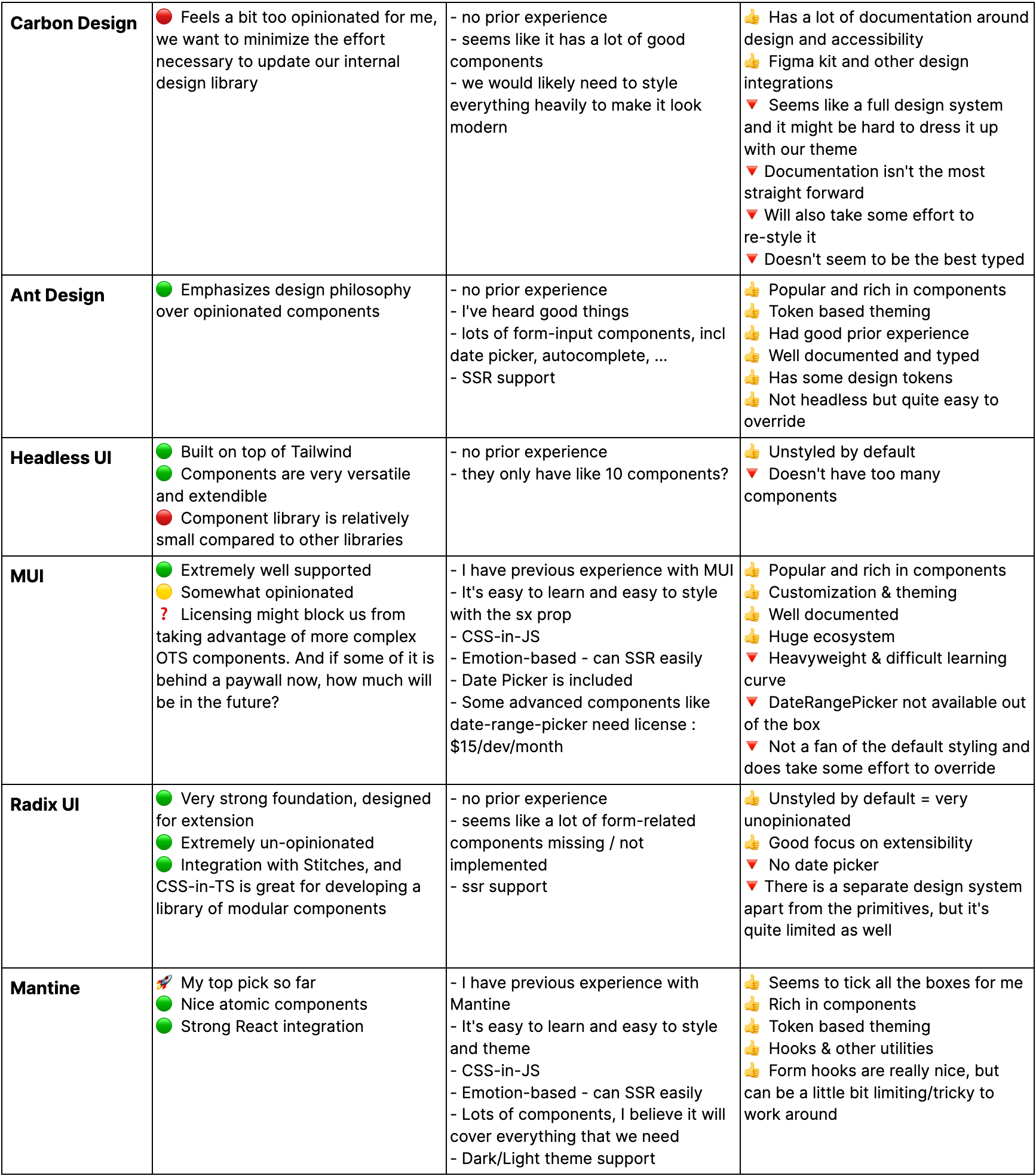
Our compared candidates were Carbon Design, Ant Design, Headless UI, MUI, Radix UI, and Mantine. While all of the options had their strengths, we tasked ourselves with evaluating each option against our specific needs: modularity, comprehensive features, and development speed.
As you can see in the table below (featuring anonymized feedback for our primary options), each engineer evaluated options based on their own criteria. We felt that this open approach allowed for us to take advantage of our team’s diverse set of experience and knowledge, rather than enforcing some sort of rubric or specific evaluation strategy.
“Level of opinionation” was something that many engineers discussed. This refers to the level at which a library was going to enforce its own specific styles or development strategy, versus an “un-opinionated” library that would allow us to easily override visual styles, extend functionality, and support our evolving visual design language that we implement in coordination with our design team.
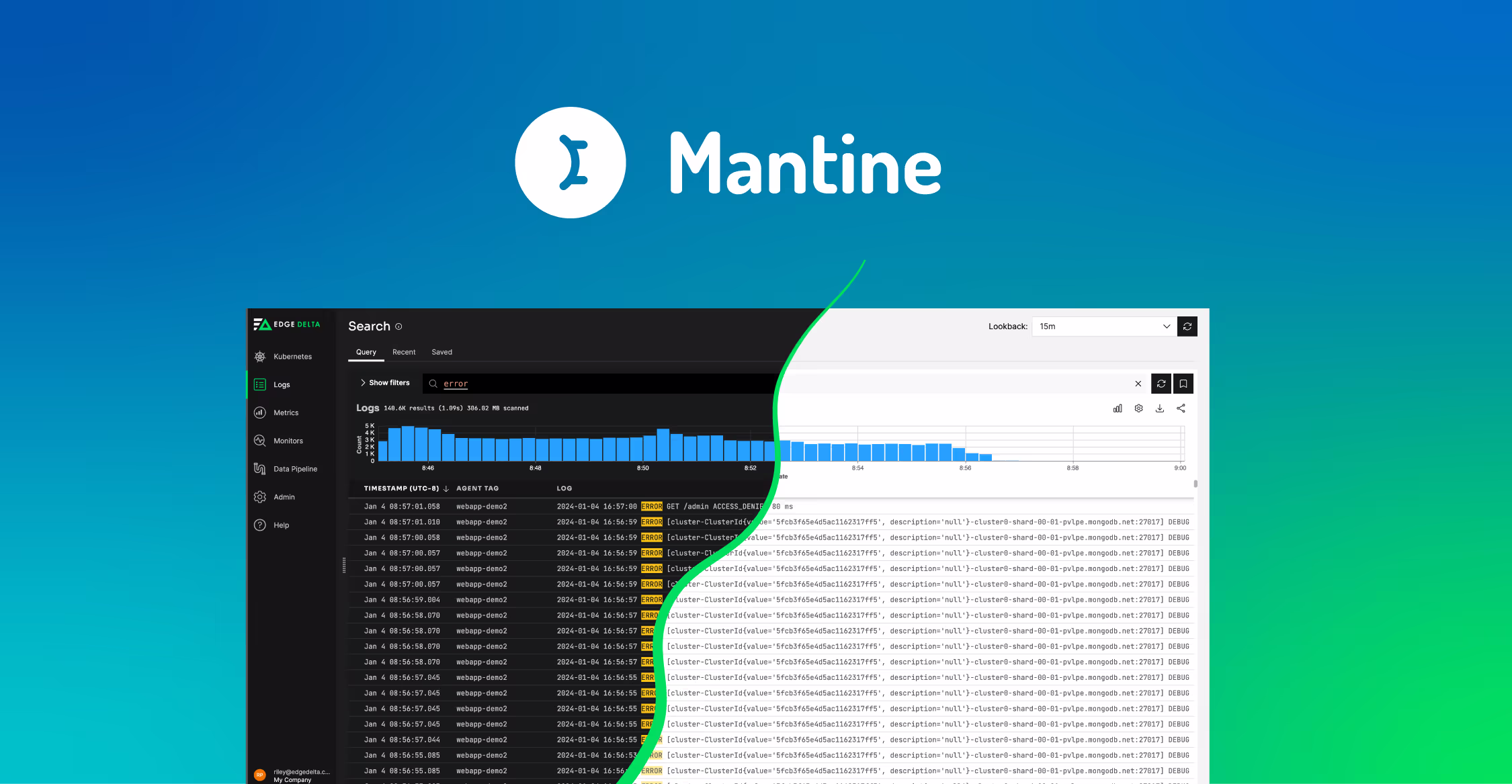
A very clear consensus did not immediately appear, simply because there are a wide array of excellent UI libraries available today for React applications. But Mantine stood out as one that not only supported our desired goals, but also leveraged experience on the team. When making a decision like this, it’s impossible to choose the perfect, future-proof option, but we felt that Mantine was the option that would best allow us to hit the ground running and immediately add value, especially because it ships with a robust library of ready-to-use components. You’ll notice that a date picker component was discussed multiple times, and this served as a loose metric for how mature a library of pre-built components would be for our purposes.
The gradual implementation of Mantine began with the basics – buttons, text fields, icons, etc. This atomic approach was strategic, allowing us to seamlessly weave Mantine into our existing infrastructure and understand its nuances without overwhelming our developers. Each component brought us closer to a cohesive and efficient development process.
But it wasn’t just about the components. Mantine’s default themes became a cornerstone of our design strategy. These themes weren’t just stylistic choices; they were foundational elements that enforced our design system and facilitated the support of multiple visual themes, like Dark and Light modes. This aspect of Mantine resonated with our vision of a flexible and dynamic user interface.
Our journey with Mantine has been underpinned by our Agile methodology. We chose to learn by doing, diving into the library and understanding its capabilities through real-world application rather than theoretical planning. This hands-on approach not only accelerated our learning curve but also aligned perfectly with our Agile development cycle, where adaptability and quick iterations are key.
Today, Mantine stands as a testament to our successful migration to React. It has become the foundation of our UI library, offering accessibility features, reducing development time, and fostering the creation of more modular components. This journey with Mantine has not just been about adopting a new tool; it has been about embracing a philosophy that resonates with our vision of growth and innovation in the ever-evolving landscape of observability.